fairy
delavina


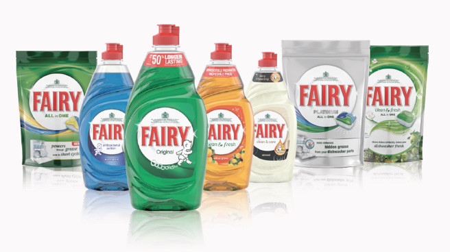
portfolio
Over the past two years, we have developed strong, meaningful strategic tools. In order to unify the brand across the globe, we have identified common PODs, redefined the purpose establishing a relevant Identity Strategy and a clear Brand Theme.
Connecting with the efforts on the WE Campaign work to create own-able iconic visual elements we've inspired the organisation to embrace
a common strategy across all regions providing a set of iconic assets to activate the purpose and delivering ONE brand look across touchpoints.
design agencies: Grey, Dialogue, Proximity, Ketchum, RN, Elmwood ; region: EMEA
consistent brand look across touchpoints
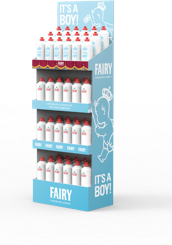
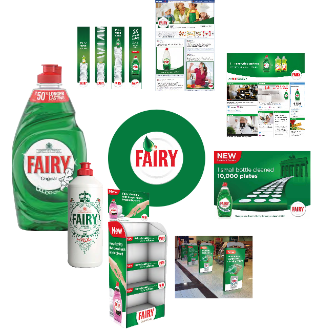
"Well thought out constructional design with excellent brand presence. Good brand visibility makes it easy to find for customers."
That’s why the design has now been awarded a Starpack Award of Excellence – winner retail ready section, which is a prerequisite to gain global recognition through winning a Worldstar Award 2014 in the Household section. On top the design is winner of the most prestigious UK Packaging Award 2013 – named retail ready pack of the year.
For P&G this has become a great example of how design can add value to the top and bottom line. Improved brand presence by using SRP’s as an in store element and lowers TDC by using a structural design fit for automation. Fairy in the UK, was the first brand to adopt the design across both discounter and mass channels delivering tangible savings and volume significantly ahead in the first weeks of shipping.
Looks beautiful and strong – even if maltreated and opened with the help of a cutter instead of using the opening perforation.
design agency: WebbDeVlam ; region: EMEA
Fairy SRP wins 3 awards of exellence
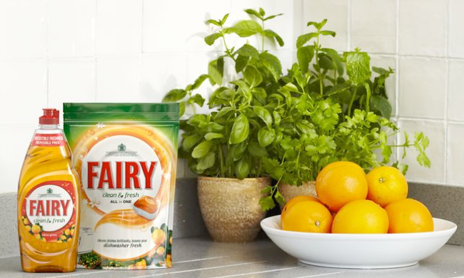
Fresh completes the Brand Architecture for the Beyond Clean consumer for the first time at a One Dish level.
It is a line extension in HDW with 2 variants (Apple and Orange)in ADW WE.
-
• Expressing freshness differentiation vs. other SKU’s and competition
-
• Supports the OneDish strategy (ADW+HDW) delivering a premium look and feel
-
• Refresh of HDW Aromatics behind One Dish artwork.
design agency: Landor ; region: WE
launch of Fairy clean&fresh
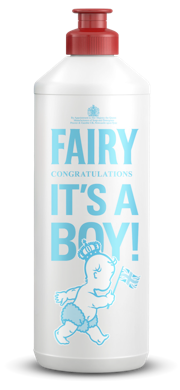
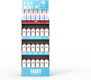
Teasing design concept to continue the success story of iconic promotions exploring the opportunity to celebratie the birth of a future king .
design agency: StudoMEM ; region: UK
a warm welcome to the royal baby

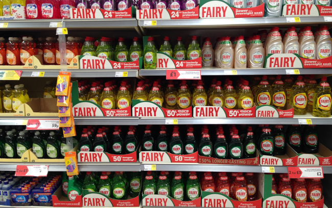
one mega brand restage
We’ve optimized the communication of the FAIRY Equity to create ONE Megabrand on shelf and communicate our premium product performance as a confident brand while ensuring a visible differentiation across tiers.
Our mission was to build solid brand assets that help to create a strong umbrella brand (Brand Block) while allowing enough flexibility to pay tribute to the differences of sub-lines.
design agency: Landor ; region: EMEA
Morrisons, UK | 03.10.2013
delavina | contact | privat policy | copyright 2013 holger koeppen | all rights reserved