siemens mobile
delavina


portfolio

creating value by design
archetypic design language
Mid 2003 Siemens Mobile Devices established a Chief Design Office in Munich to develop a design strategy, and to create the “look & feel” of Siemens Mobile Devices. At it’s time the resulting design language has set a new category standard securing “design leadership” and hence has influenced the design of major competitors like Blackberry and Nokia.
design agencies: Phoenix Design ; Platinum Design
playing variant vs alternative
Everyone wants to be different, everywhere, always. People want more than aesthetic and functional perfect products – they are looking for personal affirmation and ideal usability, that’s why emotional appealing design is growing in importance.
Little detail makes the difference, either color and material choices are delivering the inimitable finesse or the GUI allows the product staging to be a more sensual experience, both are going far beyond the functional benefit delivered by form.
color concepts


special mention for outstanding design / red dot : best of the best | 2005
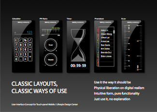
compelling graphic user interface
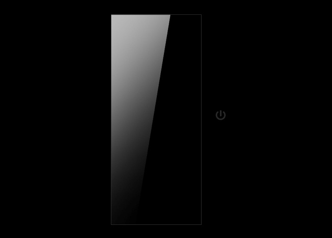
Looking into the “black slab” concept to replace the mechanical keyboard favorising touchscreen input instead Design has learned that the Phillips based software Siemens used for it’s mobile devices was requesting individual drivers to seperate input from output, hence was no able to support concepts that intended to use the full screen for both simultaniously like the I-phone.
A technical failure that could be named one root cause of Siemens mobile being history.
female emotion
The Wega project is the first 100% female phone in the portfolio. It represents a specific segment of the emotion class. It stands for stylish outstanding shapes and colors and easy to use design. Sales did not support a design freeze until they got a 2nd “safe, easy sell” version, pushing for a black instead of a pink variant.
At product launch the status was: zero orders for Black, and more than 350k pcs for flowers.
In fact the resonance for the initial flower pattern was so strong that a even more explicit variant was requested for refresh, the special edition Poppy was born.
In total product volume over lifecycle has reached nearly a Million.
design agency: Designafairs ; region: Global


S P E C I A L E D I T I O N C L 7 5 POPPY


The Inauguration of the CDO coincides with the release of a new brand strategy by the marketing and communication department.
The first “ look and feel ” design project was based on this new brand story to assure consistency within all aspects of the brand identity.


flamingo

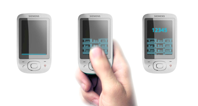
click button ,
click again,
select menu to
select media player,


Once Siemens-BenQ mobile was a global player in consumer communications.
It’s main driver was technology.
Until 2003 all design activities had been managed by the product management and marketing organization (non designers) together with designafairs, a design agency owned to 100% by Siemens and until then its “ lead agency ”.
Mid 2003 Siemens MD established a Chief Design Office, “ CDO ” in Munich.
There was no pull but we’ve changed beliefs and behaviors.
delavina | contact | privat policy | copyright 2013 holger koeppen | all rights reserved