Delightful Simplicity
In an increasingly complex and stressful world, simplicity can delight.
In design, simple can mean bland and dull.
Simple designs can be seen as cheap and generic. And yet people seek out brands that make their choices, and their lives, simpler. It’s not enough to create designs that look simple. They must be rich with meaning. They must attract and engage people, make them think, and ultimately delight them. It’s not easy to do all of this without adding complexity. But when a brand’s visual identity is both simple and delightful, it’s like a breath of fresh air.
Context is key
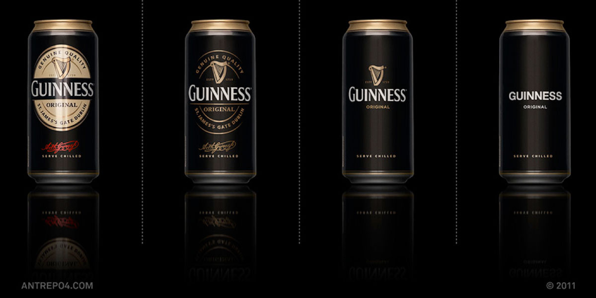
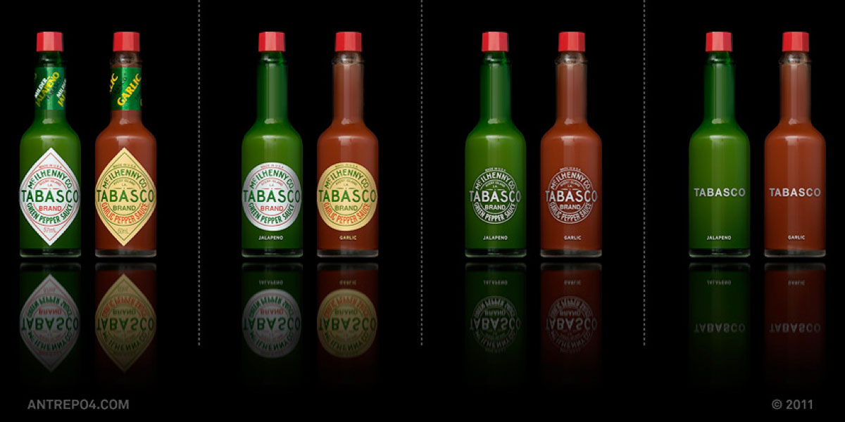
When building assets it is always worthy to look to the past to learn what already has resonated with consumers and has inherent meaning that is consistent with the brand’s equity.
You’ll need only a few assets but well chosen ones that work together to comprise a strong identity system. Visual cues are stronger than scripted typography if not turned into a visual itself.
Make assets more memorable by triggering an emotional reaction from people.
Key is to have unique offers that are differentiated but unified like a family.
Its wise to use assetes persistently and consistently across all digital and classic consumer touch-points, and over time.
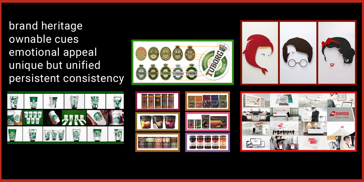
5 principles to deliver against